The year was 2012, and scientists at CERN, the European Organization for Nuclear Research, were poised to announce their groundbreaking discovery of the Higgs boson particle, a fundamental particle crucial to understanding the universe’s structure. Anticipating headlines, they were instead met with an unexpected wave of public attention focused not on their scientific triumph but on their choice of typeface for the presentation: Comic Sans. Media outlets, including The Verge, expressed astonishment that such esteemed minds had opted for a font generally associated with informal, even childish, communication. The incident, as Karin Wagner, a professor of art and visual studies, recalls, overshadowed the scientific breakthrough itself, highlighting the surprising power a typeface can wield in shaping public perception.
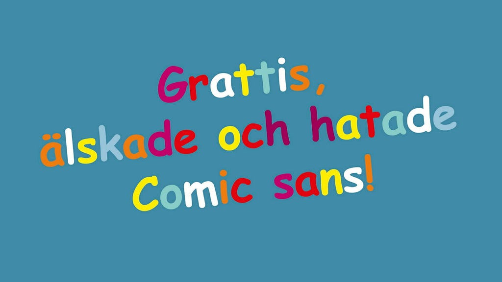
The story of Comic Sans begins in 1994 with its creator, Vincent Connare, a Microsoft designer. Intending to create a more user-friendly font for Microsoft Bob, a program designed for computer novices, Connare drew inspiration from comic book lettering, aiming for a casual and playful aesthetic. While initially confined to this specific application, Comic Sans gained widespread popularity with its inclusion in Windows 95, coinciding with the rise of personal computers and amateur graphic design. The font quickly became a staple for informal documents, invitations, and anything requiring a less formal touch than Times New Roman. This accessibility, however, also fueled its descent into infamy. As its use proliferated, so did the criticism, solidifying Comic Sans as a subject of intense debate and even disdain within the design community and beyond.
Simon Garfield, a journalist and author currently working on a series of books about typefaces, including one dedicated to Comic Sans, remarks on the peculiar intensity of the reactions it provokes. He attributes this to its ubiquity, which led to its appearance in contexts deemed inappropriate, such as ambulances and hospital signage. This, Garfield argues, signaled a shift, where non-professionals suddenly had the power to choose typefaces, previously a domain reserved for trained designers. The perceived misuse of Comic Sans became a symbol of amateurism in design. Its association with informal contexts, from children’s materials to casual social media posts, further cemented its reputation as unfit for serious or professional purposes, making its use in the CERN presentation jarring and seemingly incongruous.
Over the years, Comic Sans has accumulated a wealth of associations, from lighthearted humor to inspirational quotes, from preschool classrooms to informal Facebook posts. It is, however, its appearance in serious contexts, such as the CERN presentation or on a World War II memorial, that triggers the strongest reactions. Instances like the Dutch war memorial, where the names of fallen soldiers appeared in Comic Sans, or a Greek political party’s resignation letter written in the same font, only add fuel to the fire of its critics, who often label it as ”ugly,” ”cheap,” or simply inappropriate. These incidents highlight the perceived disconnect between the font’s informal nature and the gravity of the situations in which it’s used, further fueling the debate surrounding its legitimacy.
Karin Wagner argues that the use of Comic Sans isn’t always a sign of design ignorance. Rather, it can be a deliberate attempt to project approachability and authenticity, aiming for a specific effect. She points out that context is crucial. While acceptable in informal settings, Comic Sans would be jarringly out of place on a formal document like a Nobel banquet menu. The font’s perceived misuse stems from a mismatch between its intended informality and the seriousness of the context. This dissonance is further amplified by its easy recognizability, making it an easy target for criticism, especially in the rapid-fire environment of social media. Wagner herself finds the harsh criticism unwarranted, believing that more egregious design offenses exist, but acknowledges the font’s role as a lightning rod for design debates.
The reason behind the CERN scientists’ choice of Comic Sans for their Higgs boson presentation remains a mystery. Was it a conscious attempt to make the complex topic more accessible, or simply an oversight? Wagner suggests that, unlike corporations with dedicated design teams, scientists are less accustomed to media scrutiny and the nuances of visual communication. She also believes that the ensuing mockery may stem from a touch of schadenfreude, allowing the public to find a perceived flaw in the otherwise intimidating brilliance of scientific minds. The incident, while humorous, highlights the importance of considering the impact of design choices, especially in high-profile contexts. Despite decades of criticism, and even a “Ban Comic Sans” campaign launched in 2002, the font persists, its popularity unwavering. Attempts to create more refined alternatives have failed to dethrone it, and its enduring presence testifies to its unique appeal. Its continued use, both sincere and ironic, speaks to its accessibility and the warmth and humanity it evokes, defying its detractors and maintaining a peculiar place in the world of typography.


